This gallery contains 10 photos.
here are some of the pictures I showed in our class discussion last week which goes along with Nick Bell’s text h
Posters made for the exhibition wich I find quite interesting because done by different artist from diferent area but on with the same purpous and with a good coherence when you look at themen together. Nice graphic design layout and experimentations no?


Last friday I went to the Withechapel gallery and saw this little room where they retraced “This is tomorrow” exhibition, in this same gallery but, in 1956. It was about the organisation of it: plans, texts, videos, posters, brochures etc. I knew about this exhibition because it had a real impact in those years but I was happy to discover it with real authentic papers (or else) from this period and dig in it.
“Yesterday tomorrow is not today.”
This art exhibition started because at this period as Edward Wrigh said their was a “split between art and design”. All the art profession could participate (architect, painters, sculpture, graphic designers etc.) with their independent creation (made only for this exhibition/ no rules or subject but use of the most modern materials and ideas in new ways) and the final point was to creat one coherent and harmonious environment suggesting a model of multidisciplinary collaboration. They were no presence of interpretation panels or others information so that the visitors had to make their own analysis and judgment. They really wanted to challenge the audience. It’s a moment where art met its public – history of “the exhibition”. The final section was about advertising and was significant in reviling how the media of the 1950’s celebrated novels and mass-produced products. How these were to influence all areas of life? Permeation of technology and mass culture in everyday life. The Withchapel Gallery was considered in these years as a “playground of modern art”. (Is it still now?) The modern art was here to “entertain people” and was a “game people wanted to play” (quotes from Lawrence Alloway). It was a new approach to visual arts for this period and was precursory of Pop Art in Britain.
“Man’s visual environment is a mess today because most people have eyes that does not see; they do not feel the need for visual organisation.” Lawrence Alloway
Is that where we are back today? Is a new sort of order needed? I didn’t feel like those problems were solved in our era and I thought it was important they reinstalled those pieces of work because it made me realised that I needed to think more about all the points they lifted.


———————————————————————————-
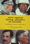
This “news item” was found yesterday on yahoo’s news page. My first reaction was laughing, but while analyzing this small item I understood how ridiculous the power of brands had become. I wonder if who ever wrote this peice was thinking about the meaning of its header, or was it just pure and fast intuition. Who made whom famous, Piccadilly Circus Sanyo or the other way around ? Who is losing by taking off the sign, The Circus or the corporate ? I believe that the Circus built in 1819 has much more of a narrative to offer than Sanyo. The Piccadily Circus is a London landmark, it was alive, bustling and kicking way before Sanyo was incorporated, and in terms of branding I think that Piccadilly Circus is much stronger than Sanyo, and has a bigger “promise”. I’m sure that there is a Que of corporates waiting for Sanyo to evacuate their sign, but in my heart I know that the real losers are us, fascinated by the next neon to come.
Feb 25
This gallery contains 10 photos.
here are some of the pictures I showed in our class discussion last week which goes along with Nick Bell’s text h
Galleries transfere an object into art and the artwork transferes the container into a gallery.
Based on how a gallery is constructed and how the piece of art is arranged it becomes art automatically, not only the building itself, but in the way the work is displayed and the appropriate behavior, nominates the piece of art into art, it is also nominated by the visitor. Art is a widespread term and the most important aspect about art is that it is in the spectators point of view whether he or she considers it to be called art or not. Certainly the philosophy of “White Cube” is supporting this aspect. In that very moment in which the object is placed in a gallery and the way how it is placed leads to a fast recognition. Or how Georges Bataille would say “that it should be taken into account that the rooms and art objects form only the container, the content of which is formed by the visitors. It is this content that distinguishes a museum from a private collection. A museum is like the lungs of a city” The following is a summary by Brian O´Doherty:
“The ideal gallery subtracts from the artwork all cues that interfere with the fact that it is “art”. The work is isolated from everything that would detract from its own evaluation of itself. This gives the space a presence possessed by other spaces where conventions are preserved through the repetition of a closed system of values. Some of the sanctity of the church, the formality of the courtroom, the mystique of the experimental laboratory joins with chic design to produce a unique chamber of esthetics. So powerful are the perceptual fields of force within this chamber that, once outside it, art can laps into secular status. Conversely, things become art in a space where powerful ideas about art focus on them”.
There is a intersting dependence between the gallery and the object which is recognized as artwork in and through the gallery, and the artwork that transferes the container into a gallery – both need the visitor to justify their excistence and to get recognized!
In reaction to Taro post “Minimalist effect in the maximalist market”
I believe logos are being simplified but also always redesigned with a similar axe: “it must feel like it’s 3D or it won’t work!” I don’t know of it’s a good thing but in my point of view I feel they are all looking a bit the same and yes they are more modern and “more like logos should be now” but don’t you prefer the oldest ones? Aren’t they more trustful? Maybe it’s nostalgia and as Neville Brody said in the lecture: “Don’t get nostalgic it doesn’t help graphic design, go forward.” I feel that making logos more like moving and “3D style” is a little bit pointless and sometime used without purpose because for my part we see this change in all the big brands. Does it help them to sell their products? Have their products changed as well as the logo indicates? Maybe. But I don’t know if it’s like a fashion or a real point of view.

![]()


“Is the experience of an art gallery fundamentally different than the experience of a supermarket ?”
Nick Bell asks this question in “The Steam Roller of Branding” regarding the issue of “branding culture”, especially art galleries as the Tate, Barbican and the Whitechapel Gallery. It is very interesting to examine the approach of early 60’s Pop artists to the very same question. The Brillo soap pad boxes, Campbell’s soup packaging and the Heinz tomato ketchup box were all made between 1962-1964 by Andy Warhol. All of these art works were created with industial production methods such as screen print, and address the question of the separation of art from mass culture. These works contain a very strong message about the consumer society and its hunger for more. In my opinion Andy Warhol was saying that the art galleries of that period were to “clean” and “rich” and by creating a “supermarket” experience in the gallery he draws a new line between art and consuming. This is the very same line that disturbs Nick Bell.
“they believe their customers need to be lured to look at art with a mode of address they understand from spending time in the supermarket”
I think that Artist like Andy Warhol changed the art scene and turned it to what it is today, there is no doubt it is an aesthetic and spiritual sensation to see art work in a gallery, but it is also a consuming experience. While visiting a gallery, how many times did you say to yourself “I would hang this piece on my beautiful exposed brick wall – if I could afford it”. To me, Nick Bell’s message is the opposite of Andy Warhol’s. While Andy Warhol’s attitude is art is fun, art can deliver a message, lets mix things up, Nick Bell’s attitude is Art is serious, we cant treat it like it is business, its holy, please be gentle with the branding. I prefer the first approach, artists create art, and then they sell it, I see no reason treating an art gallery (graphically) differently than any other institution, (Yes, including a supermarket) as long as the graphic identity delivers the content of the institution.
This is the website that I showed in the peer group meeting. They have their own researches on brands and how it contributes or doesn’t contribute to the society.
And this is their manifesto;
Civil Branding encourages marketing professionals to their brands as a tool for building a better society. The thinking behind the effort can be summarised by the following:
No. 1
We believe that mass communications used for brand-building have the ability to make a profound positive impact on society.
No. 2
As marketers, we can use communications to raise important ideas, promote progressive values and encourage each other to build a more civil society.
No. 3
Promoting messages that bring us together as a society and encourage more civilising ideas helps differentiate the brands we build and contributes toward building a better society.